BC Critical Minerals Office – Brand Identity & Presentation Design
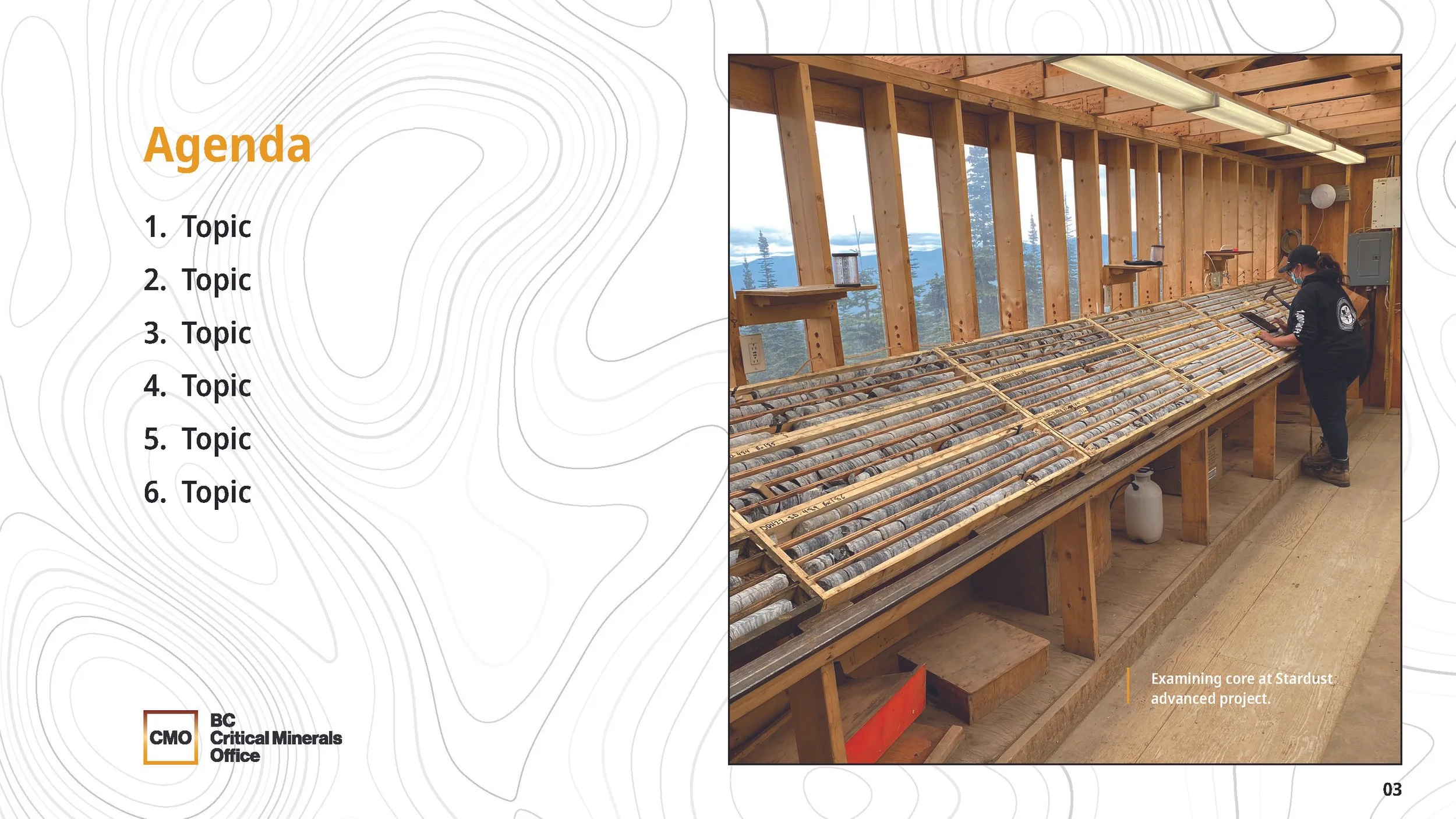
Commissioned by the Ministry of Energy, Mines and Low Carbon Innovation, I developed a modern, modular logo for the newly formed BC Critical Minerals Office. The selected design draws inspiration from the Periodic Table, symbolizing the elemental foundation of the sector while conveying structure, innovation, and clarity. The identity was extended into a PowerPoint presentation system that introduced the office’s mandate and visual direction—balancing technical precision with a clean, professional aesthetic aligned to BC Government standards.
Related project: Atlas of Critical Minerals in British Columbia – Publication Design
I also designed the layout for the companion publication documenting mineral distribution and economic potential across BC, produced by the Ministry of Energy, Mines and Low Carbon Innovation.


