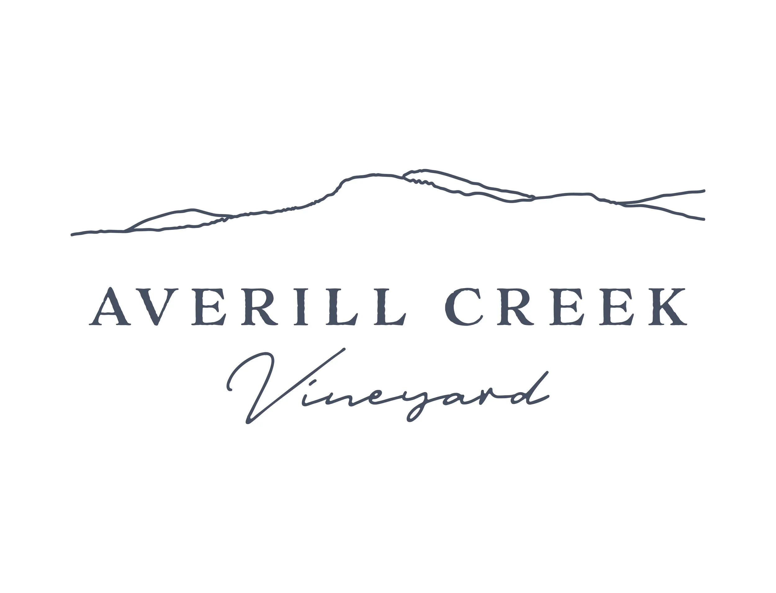
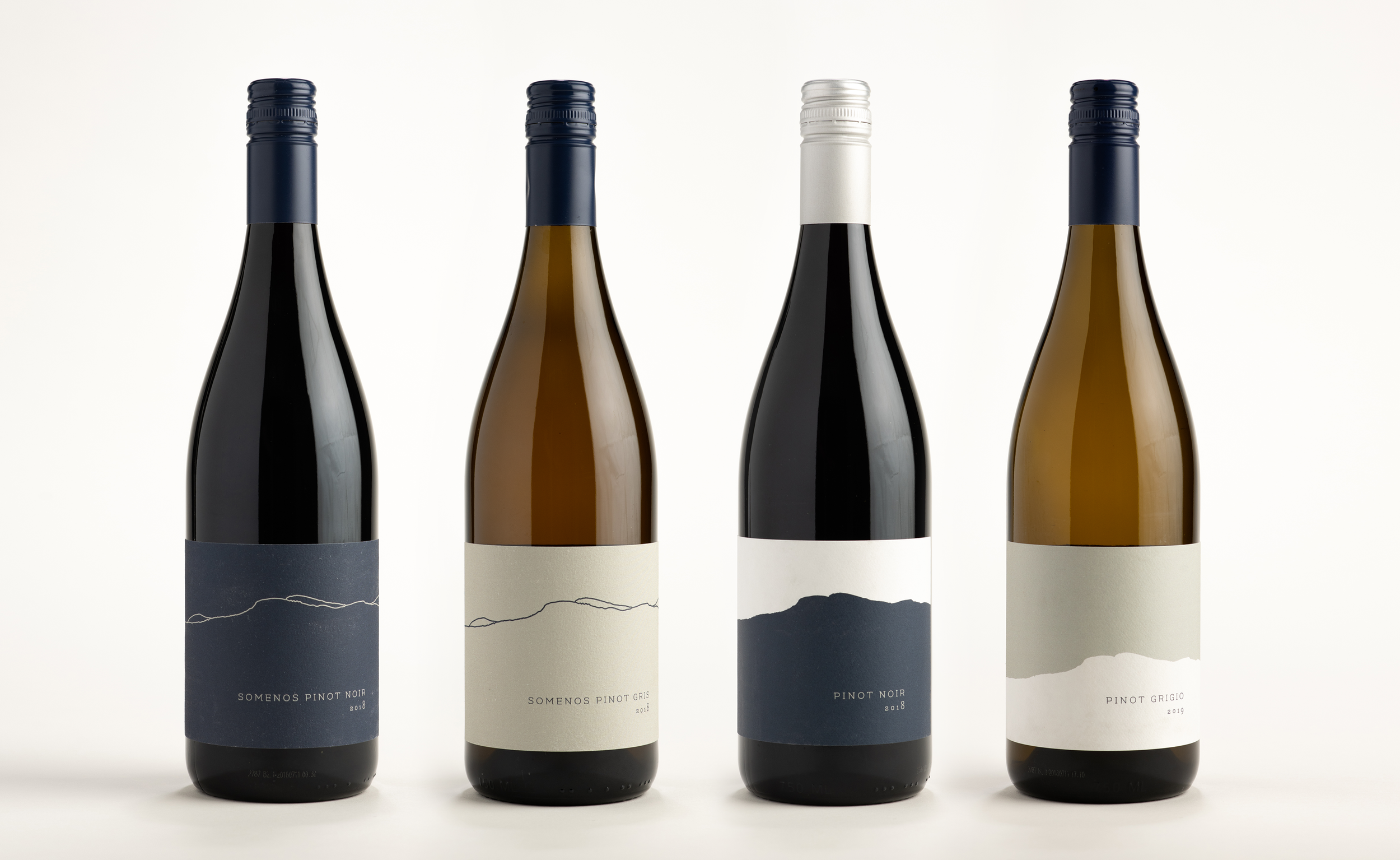
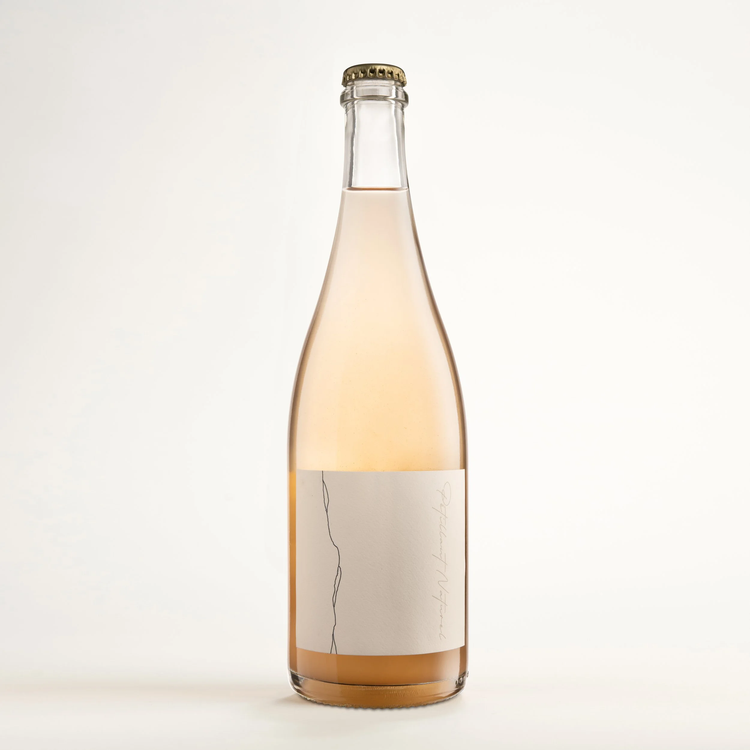
Averill Creek Vineyard
Averill Creek Vineyard was seeking a re-brand to reflect their identity and their tie to the land they produce wine on. Situated on the slopes of Mount Prevost, the logo shows the silhouette of the mountain top and the typography reflects the traditional methods of making wine that they practice. The mountain silhouette was transferred to the design of their labels. averillcreek.ca